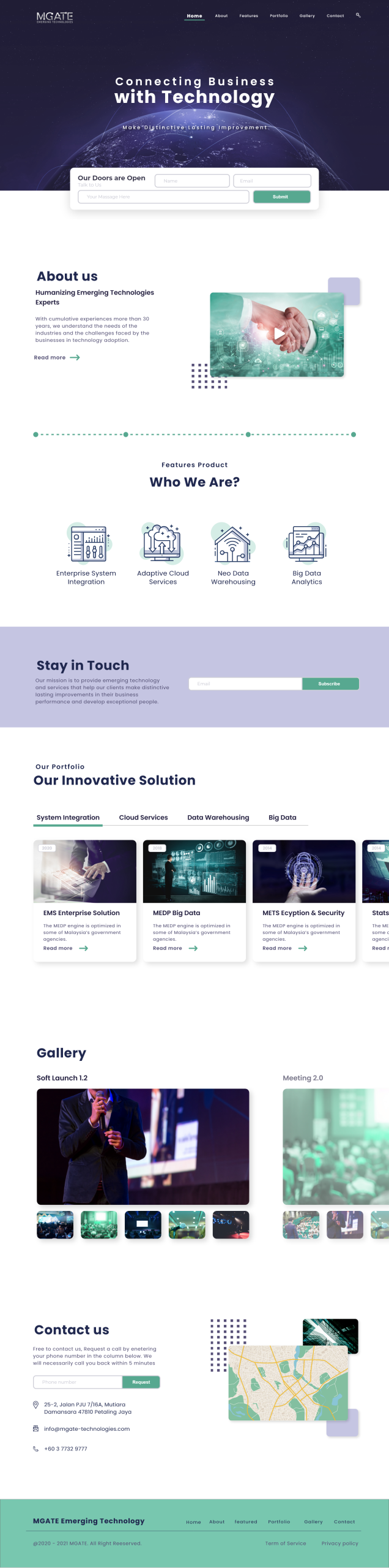
Mgate Emerging Technologies is a corporate solutions provider that helps businesses and governments redefine how they serve connected customers and operate in a digitally connected world. Their website serves as a key platform for presenting their innovative services and professional image to stakeholders.
Project Type
Website Design
Category / Area
UI/UX Design
My Role
Conducted UX audit and competitive analysis
Developed wireframes and high-fidelity UI mockups
Focused on simplicity, usability, and responsiveness across devices
Ensured alignment with the company’s vision and brand identity
02
Objective
The main goal of this project was to redesign Mgate’s outdated corporate website. The previous design failed to convey the company’s forward-thinking and professional identity. To reflects the brand’s values and builds credibility, he client requested :-
Modern
Clear
User-Friendly Interface
Low-Fidality
Wireframe
Were used in the early stages to quickly visualize layout ideas, plan user flow, and get client feedback without focusing on visual design. They helped validate the structure and content hierarchy before investing time in detailed visuals.
03
Wireframe & Prototyping
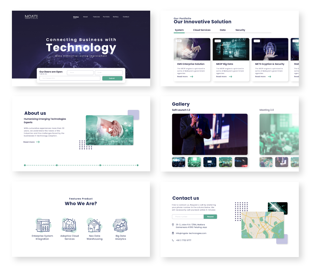
Developed both low-fidelity wireframes to outline structure and user flow, and high-fidelity interactive prototypes to simulate the final user experience. This helped validate layout decisions and ensure smooth stakeholder alignment before development.
High-Fidality
Prototypes
followed once the layout was approved. These included final UI elements like typography, colors, and icons—offering a realistic preview of the final product. They allowed stakeholders to interact with the design, test usability, and align expectations before development.
04
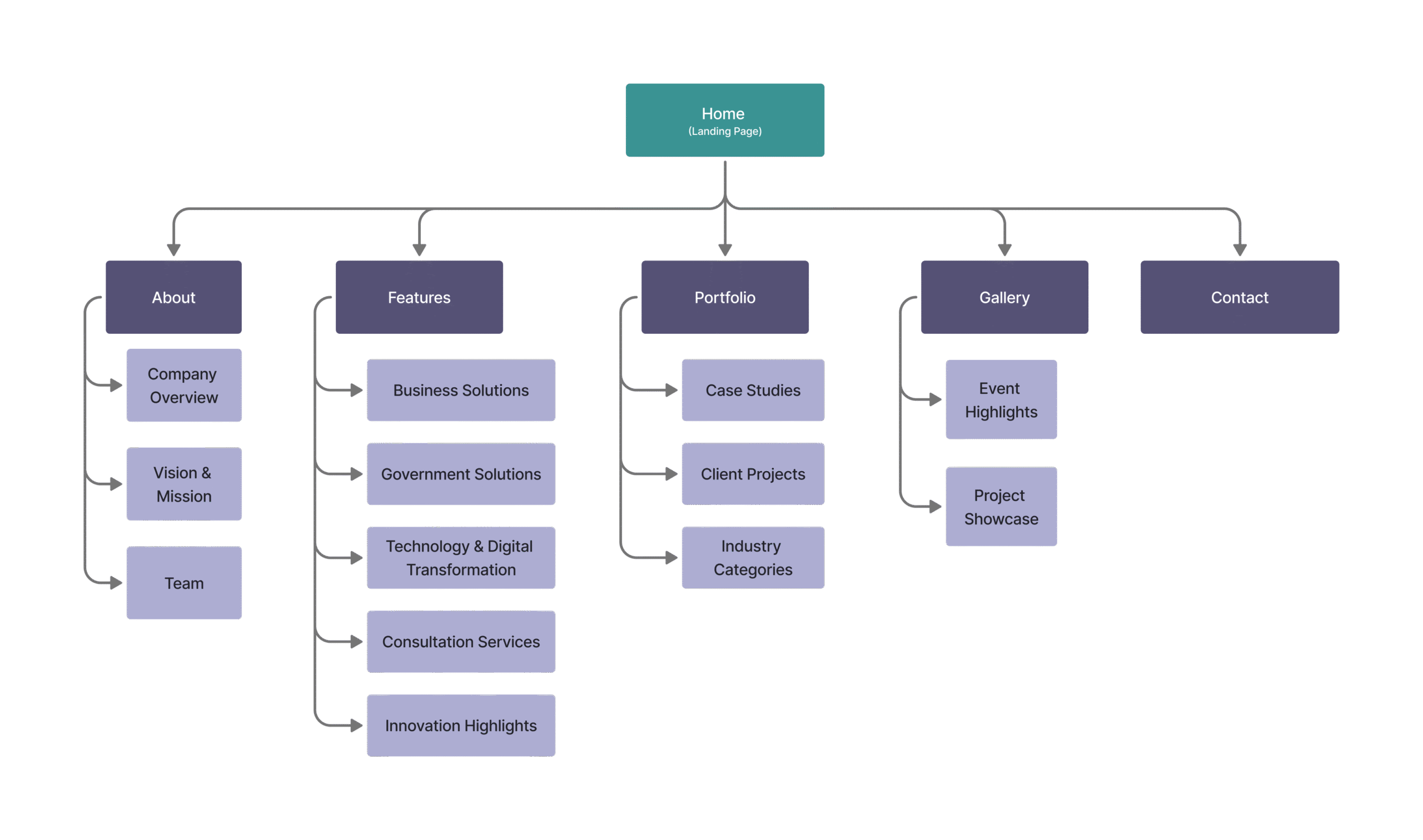
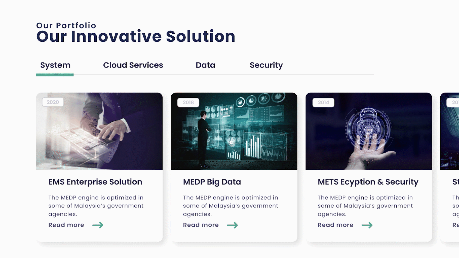
Sitemap
To enhance navigation and ensure a user-friendly experience, I structured the Mgate Emerging Technologies website with a clear and intuitive sitemap. The parent menus were carefully selected to align with user expectations and corporate communication goals.
The sitemap consists of six main sections:
05
Design System
Established a consistent and scalable design system to enhance user experience and brand identity :
Font
Typography
Poppins
Style
Weight
Size
Headline
Bold
30 px
Menu
Regular
15 px
Button
Bold
18 px
Paragraph
Regular
15 px
Palette
Color
Primary 900
#20284F
Primary 500
#555175
Primary 100
#AEAED3
Secondary 600
#3A9393
Secondary 300
#82BAAA
Palette
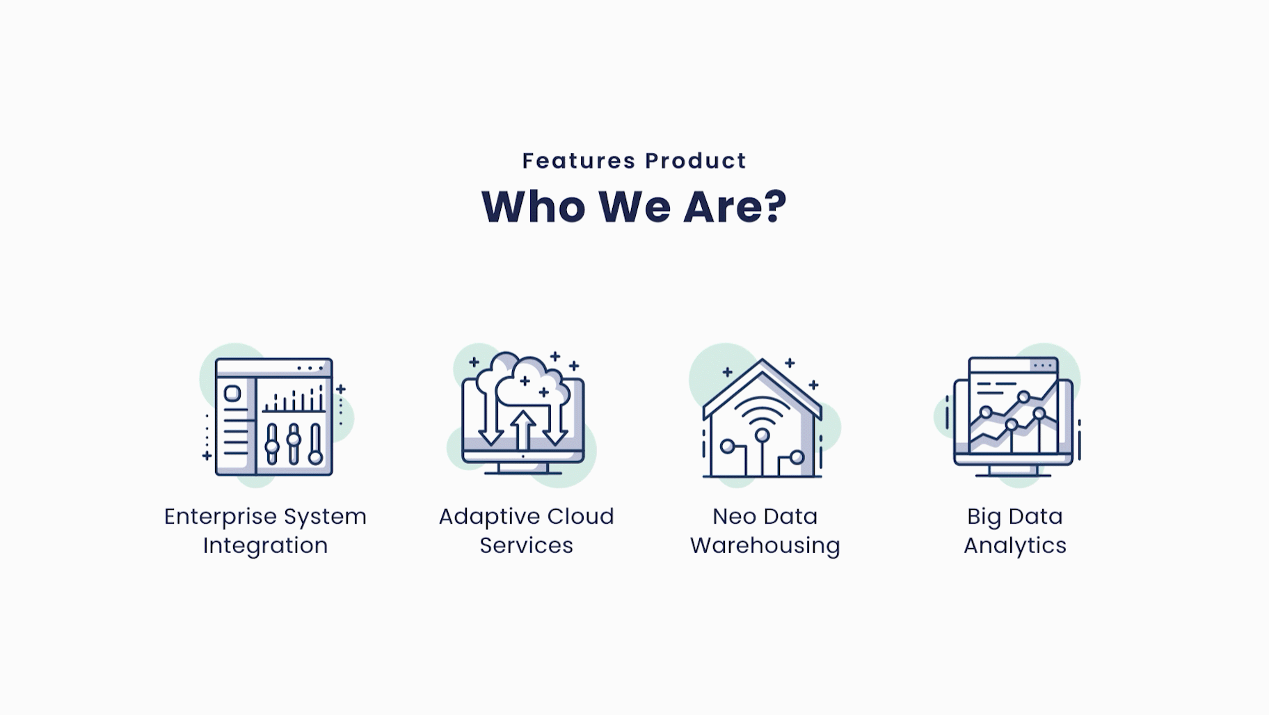
Iconography
Integration
Cloud
Warehousing
Analytics
Search
User
Home
Contact
Email
Address
05
Responsive
The website is fully responsive, optimized for desktop, tablet, and mobile devices to ensure a seamless user experience across all screen sizes.