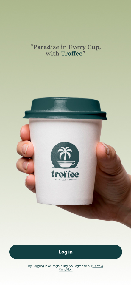
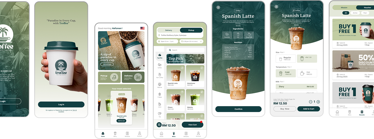
TroFfee is a passion project created to explore how design can merge tropical brand identity with a modern mobile ordering experience. The app focuses on delivering a seamless journey where users can browse the menu, customize their drinks, place orders, and enjoy a coffee experience that feels refreshing and effortless.
Project Type
Mobile App Design
Interaction Design
Motion Design
Category / Area
U/UX
Graphics
Motion
Interactive
My Role
UI/UX Design – crafted user flows, wireframes, and high-fidelity prototypes.
Order Journey Mapping – designed intuitive steps from menu browsing to checkout.
Interactive Prototyping – built clickable mockups for user testing
User Experience Optimization – simplified navigation and improved usability for mobile ordering
Tool I Use
Figma
Illustrator
Photoshop
After Effects
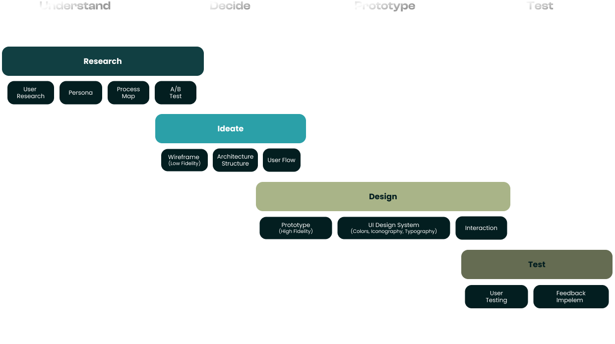
Design Process
The design approach follows a user-centered UI/UX process, ensuring the Troffee app delivers both functionality and delightful experiences:
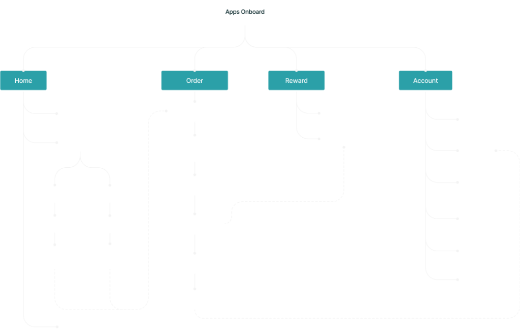
Architecture Structure
The app’s architecture is designed with a clear, user-friendly flow. Each layer is structured to ensure smooth navigation, minimal steps, and a consistent brand experience—combining simplicity, clarity, and tropical-inspired design.
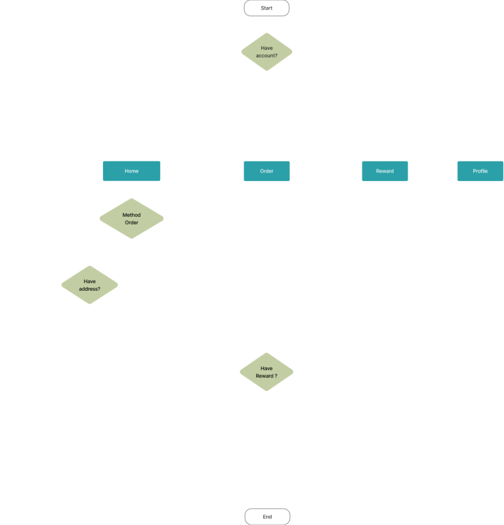
User Flow
The user flow is designed to be simple and intuitive: users start with Login/Sign Up, then move to Browse Menu, Select Items, Add to Cart, Make Payment, and finally Track Order & Earn Rewards.
Wireframe
Low-fidelity wireframes defined the user flow, while high-fidelity prototypes showcased TroFfee’s branding, visuals, and interactions for a seamless app experience.
Design System
This style guide ensures cohesion, usability, and brand recognition across all app screens.
Iconography
The TroFfee app uses a clean line icon style to represent its features and navigation. The icons are designed to be minimal, modern, and highly legible, ensuring an intuitive user experience. Each icon reflects coffee culture and tropical elements, reinforcing the brand’s identity while maintaining simplicity and elegance.
48 px - Large
Small
Large
Cold
Hot
36 px - Medium
Home
Menu
Reward
Account
Top Pick
Coffee
Non-coffee
Matcha
Frappe
Juice
Tea
Pastries
16 px - Small
Location
Shop
Timing
Search
Choc
Coffee
Tea
Prata
Aa
Aa Bb Cc Dd Ee Ff Gg Hh Ii Jj Kk Ll Mm Nn Oo Pp Qq Rs Ss Tt Uu Vv Ww Xx Yy Zz
Poppins
Aa
Aa Bb Cc Dd Ee Ff Gg Hh Ii Jj Kk Ll Mm Nn Oo Pp Qq Rs Ss Tt Uu Vv Ww Xx Yy Zz
Typography
Font pairing of Sentient and Poppins to balance creativity with readability. This combination creates a harmonious visual hierarchy, where Prata adds character while Poppins ensures functionality, resulting in a design that is both engaging and user-friendly.
Color Palette
Its uses a nature-inspired palette to reflect its tropical coffee brand identity :
Primary (Green)
Represents freshness, growth, and the tropical essence of the brand.
Secondary (Beige)
Evokes warmth, coffee beans, and an earthy balance.
Contrast (Gray)
Provides contrast and readability, ensuring a modern and professional look.
#113F42
#A9B488
#E4E8DA
#B1895E
#D1B196
#113F42
#4C4C4C
#777777
#C5C5C5
#F1F1F1
User Interface
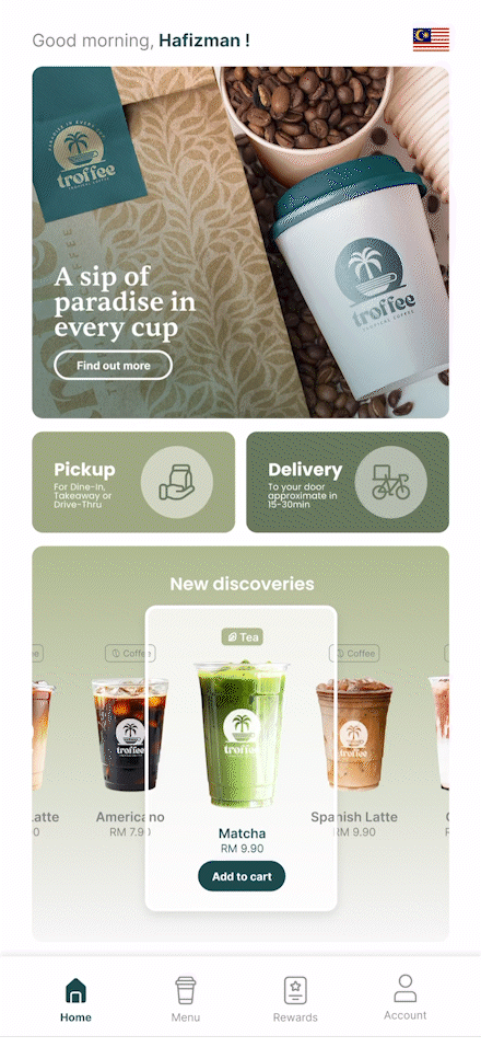
Home page
Highlight
Highlight carousel with smooth motion to showcase featured beverages and enhance user engagement. This interactive feature allows users to swipe through the drinks, each presented with appealing visuals, names, prices and quick add to cart options.
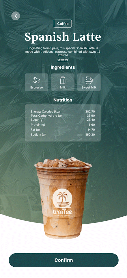
Detail Page
Summary
Before users select their drink preferences, the app displays a detailed summary that includes the description, ingredients, and nutrition facts. This feature is designed to promote health awareness, helping customers make informed choices about what they consume.
By presenting transparency and useful details up front, TroFfee builds trust and value for health-conscious users while enhancing the overall customer experience.
Prototyping
The high-fidelity prototype translated the wireframes into a polished visual design using the TroFfee brand identity.